Black Diamond is a family-owned business in the oil and gas industry looking to elevate their brand, taking it from a trusted local operation to a prominent global distributor. Through strategic collaboration, we redefined their positioning, enhancing their visual identity and brand presence to reflect their ambitions on the world stage.
The previous logo carried years of history but limited the company’s visual presence. Our redesign aimed to open the door to a timeless and enduring identity — one that reflects both legacy and modern strength. Using a bold, all-caps typeface, we conveyed power, trust, and stability.
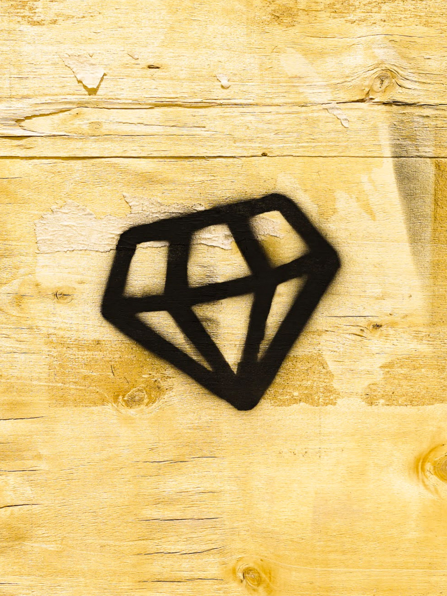
At the center of the design, the newly crafted diamond icon symbolizes passion and integrity — core values that define Black Diamond Drilling. Positioned at the heart of the logotype, the diamond embodies the family’s care for their business and the enduring trust they’ve built within the industry.


Custom iconography was designed specifically for their website categories. Meticulously forming a simplistic visual description of each category name without breaking design consistency.


The success of the new identity inspired Black Diamond's owners to expand their brand into a merchandise line, launching a hat company that would house all their gear. This extension allowed their loyal customers to proudly represent the brand both on and off the field, further strengthening their connection with the community.
